Outline
2.1 Introduction
2.2 Visual Studio .NET Integrated Development Environment (IDE) Overview
2.3 Menu Bar and Toolbar
2.4 Visual Studio .NET Windows
2.4.1 Solution Explorer
2.4.2 Toolbox
2.4.3 Properties Window
2.5 Using Help
2.6 Simple Program: Displaying Text and an Image
2.1 Introduction
-Visual Studio .NET is Microsoft’s integrated development environment (IDE) for creating,
documenting, running and debugging programs written in a variety of .NET programming
languages. Visual Studio .NET also offers editing tools for manipulating several types of
files. Visual Studio .NET is a powerful and sophisticated tool for creating business-critical
and mission-critical applications. In this chapter, we provide an overview of the Visual Stu-
dio .NET features needed to create a simple C# program. We introduce additional IDE fea-
tures throughout the book.
2.2 Visual Studio .NET Integrated Development Environment (IDE) Overview
-When Visual Studio .NET is executed for the first time, the Start Page is displayed
(Fig. 2.1). This page contains helpful links, which appear on the left side of the Start
Page. Users can click the name of a section (such as Get Started) to browse its contents.
We refer to single-clicking with the left mouse button as selecting or clicking and to click-
ing twice with the left mouse button as double-clicking. [Note: The user should be aware
that there are slight differences in the way Visual Studio appears based on the version being
used.]
The Get Started section contains links to recently opened projects. The most recently
opened projects appear on this list (such as ASimpleProgram in Fig. 2.1), along with
their modification dates. Alternately, the user can go to the select Recent Projects from
the File menu. The first time Visual Studio .NET is loaded, this section will be empty.
There are two buttons on the page: Open Project and New Project. A button is a raised,
rectangular area that performs an action when clicked.
The What’s New section displays new features and updates for Visual Studio .NET,
including downloads for code samples and new programming tools. The Online Commu-
nity section includes ways to contact other software developers, using newsgroups, Web
pages and other online resources. The Headlines section provides a way to browse news,
2.3 Menu Bar and Toolbar


2.1 Introduction
2.2 Visual Studio .NET Integrated Development Environment (IDE) Overview
2.3 Menu Bar and Toolbar
2.4 Visual Studio .NET Windows
2.4.1 Solution Explorer
2.4.2 Toolbox
2.4.3 Properties Window
2.5 Using Help
2.6 Simple Program: Displaying Text and an Image
2.1 Introduction
-Visual Studio .NET is Microsoft’s integrated development environment (IDE) for creating,
documenting, running and debugging programs written in a variety of .NET programming
languages. Visual Studio .NET also offers editing tools for manipulating several types of
files. Visual Studio .NET is a powerful and sophisticated tool for creating business-critical
and mission-critical applications. In this chapter, we provide an overview of the Visual Stu-
dio .NET features needed to create a simple C# program. We introduce additional IDE fea-
tures throughout the book.
2.2 Visual Studio .NET Integrated Development Environment (IDE) Overview
-When Visual Studio .NET is executed for the first time, the Start Page is displayed
(Fig. 2.1). This page contains helpful links, which appear on the left side of the Start
Page. Users can click the name of a section (such as Get Started) to browse its contents.
We refer to single-clicking with the left mouse button as selecting or clicking and to click-
ing twice with the left mouse button as double-clicking. [Note: The user should be aware
that there are slight differences in the way Visual Studio appears based on the version being
used.]
The Get Started section contains links to recently opened projects. The most recently
opened projects appear on this list (such as ASimpleProgram in Fig. 2.1), along with
their modification dates. Alternately, the user can go to the select Recent Projects from
the File menu. The first time Visual Studio .NET is loaded, this section will be empty.
There are two buttons on the page: Open Project and New Project. A button is a raised,
rectangular area that performs an action when clicked.
The What’s New section displays new features and updates for Visual Studio .NET,
including downloads for code samples and new programming tools. The Online Commu-
nity section includes ways to contact other software developers, using newsgroups, Web
pages and other online resources. The Headlines section provides a way to browse news,
 |
| Start Page in Visual Studio .NET. |
Articles and how-to guides. Use the Search Online section to browse through the MSDN
(Microsoft Developer Network) online library. The MSDN site includes numerous articles,
downloads and tutorials for a variety of technologies. The Downloads section allows the
user to obtain updates and code samples. The XML Web Services page provides pro-
grammers with information about Web services, which are reusable pieces of software
available on the Internet. We discuss this technology in Chapter 21, ASP .NET and Web
Services. Web Hosting provides information for developers who wish to post their soft-
ware (such as Web services) online for public use. The My Profile page allows users to
customize Visual Studio .NET, such as setting keyboard and window layout preferences.
Users also can customize Visual Studio .NET selecting Options… or Customize… from
the Tools menu. [Note: From this point forward, we use the > character to indicate the
selection of a menu command. For example, we use the notation Tools > Options… and
Tools > Customize… to indicate the selection of the Options… and Customize…
commands, respectively.] Visual Studio .NET can even browse the Web—Internet
Explorer is part of the IDE. To access a Web page, type its address into the location bar
and press the Enter key. [Note: The computer must be connected to the Internet.]
windows in the following sections.
To create a new C# program, click the New Project button in the Get Started sec-
tion. This action displays the dialog in Fig. 2.2. Dialogs are windows used to communicate
with users. They typically contain buttons that allow the users to make decisions.
Visual Studio .NET organizes programs into projects and solutions. A project is a group
of related files, such as C# code, images and documentation. A solution is a group of projects
that represent a complete application, or a set of related applications. Each project in the
solution may perform a different task. In this chapter, we create a single-project solution.
Visual Studio .NET allows us to create projects in a variety of programming languages.
This book focuses on C#, so select the Visual C# Projects folder (Fig. 2.2). There are a
variety of project types from which to choose, several of which are used throughout this
book. In this case, create a Windows application. Windows applications are programs that
execute inside the Windows OS, like Microsoft Word, Internet Explorer and Visual Studio
.NET. Typically, they contain controls—graphical elements, such as buttons and labels—
with which the user interacts.
By default, Visual Studio .NET assigns the name WindowsApplication1 to the
project and to the solution (Fig. 2.2). The default location for storing related files is the
folder where the last project was created. The first time Visual Studio .NET executes, the
default folder is the Visual Studio Projects folder in the My Documents folder. The
user can change both the name and the location of the folder in which to save the project.
After selecting a name and location for the project, click OK in the New Project dialog.
The IDE will then change its appearance,as shown in the fig 2.3.
 |
| fig 2.2 New project dialog |
 |
| fig 2.3 Visual Studio .NET environment after a new project has been created. |
The gray rectangle represents the window for our application. This rectangle is called
the form. We discuss how to add controls to the form later in this chapter. The form and con-
trols are the graphical user interface (GUI) of the program. They are the graphical compo-
nents through which the user interacts with the program. Users enter data (inputs) into the
program by entering information from the keyboard and by clicking the mouse buttons. The
program displays instructions and other information (outputs) for users to read in the GUI.
The top of the IDE window (the title bar in Fig. 2.3) displays Windows-
Application1 - Microsoft Visual C# .NET [design] - Form1.cs [Design]. This title
provides the name of the project (WindowsApplication1), the programming language
(Microsoft Visual C# .NET), the mode of the IDE (design mode), the file being viewed
(Form1.cs) and the mode of the file being viewed (Design mode). The file name
Form1.cs is the default for Windows applications. We discuss the various modes in
Section 2.6.
Notice how a tab appears for each open document. In our case, the documents are the
Start Page and Form1.cs [Design]. To view a tabbed document, click the tab with the
name of the document you wish to view. Tabbing saves space and allows easy access to
multiple documents.
Commands for managing the IDE and for developing, maintaining and executing programs
Performance Tip 2.1
If you experience slow response times from Visual Studio, you can disable (i.e., close) Dynamic Help by clicking the X in the upper-right corner of the window.
In addition to dynamic help, Visual Studio .NET provides context-sensitive help. Con-
text-sensitive help is similar to dynamic help, except that context-sensitive text immedi-
ately brings up a relevant help article rather than presenting a list. To use context-sensitive
help, select an item and press the F1 key. Help can appear either internally or externally.
With external help, a relevant article immediately pops up in a separate window, outside
the IDE. With internal help, a help article appears as a tabbed window inside Visual Studio
.NET. The help options can be set from the My Profile section of the Start Page.
Dynamic help and context-sensitive help are explained in the context of C# code later in
the book.
are contained in the menus. Figure 2.4 shows the menus displayed on the menu bar. Menus contain groups of related commands that, when selected, cause the IDE to perform various actions (e.g., open a window). For example, new projects can be created by selecting File >New > Project... from the menu bar. The menus shown in Fig. 2.4 are summarized in
Fig. 2.5. Visual Studio .NET provides different modes for the user. One of these modes is
the design mode, which will be discussed later. Certain menu items appear only in specific
IDE modes.Rather than having to navigate the menus for certain commonly used commands, the
programmer can access the commands from the toolbar (Fig. 2.6). The toolbar contains
pictures called icons that represent commands. To execute a command, click its icon. Click
the down arrow beside an icon to display other available options. Figure 2.6 shows the standard
(default) toolbar and an icon that uses the down arrow.
 |
| Fig. 2.4 Visual Studio .NET menu bar. |
 |
| Fig. 2.5 Visual Studio .NET menu summary. |
 |
| Fig. 2.6 Visual Studio .NET toolbar. |
Holding the mouse pointer over an icon on the toolbar highlights that icon and displays
a description called a tool tip (Fig. 2.7). Tool tips help users understand the purposes of
unfamiliar icons.
2.4 Visual Studio .NET Windows
Visual Studio .NET provides users with windows for exploring files and customizing con-
trols. In this section, we discuss the windows that are essential for developing C# applica-
tions. These windows can be accessed using the toolbar icons below the menu bar and on
the right edge of the toolbar (Fig. 2.8), or by selecting the name of the desired window from
the View menu.
2.4.1 Solution Explorer
The Solution Explorer window (Fig. 2.9) lists all the files in the solution. When Visual
Studio .NET is first loaded, the Solution Explorer is empty—there are no files to display.
After a new project has been created or an existing project has been loaded, the Solution
Explorer displays that project’s contents.
The startup project of the solution is the project that runs when the solution is exe-
cuted. It appears in bold text in the Solution Explorer. For our single-project solution,
the startup project (WindowsApplication1) is the only project. The C# file is
Form1.cs; it contains the program’s code. We discuss the other files and folders later in
the book.
The plus and minus boxes to the left of the project and solution names expand and col-
lapse the tree, respectively (similar to those in Windows Explorer). Click a plus box to dis-
play more options; click a minus box to collapse a tree that already is expanded. Users also
can expand or collapse a tree by double-clicking the name of the folder. Many other Visual
Studio .NET windows use the plus/minus convention as well.
 |
| Fig. 2.7 Tool tip demonstration. |
 |
| Fig. 2.8 Toolbar icons for various Visual Studio .NET windows. |
 |
| Fig. 2.9 Solution Explorer window. |
The Solution Explorer contains a toolbar. One icon on the toolbar reloads the files
in the solution (refreshes), and another icon displays all files in the solution (including
hidden ones). The number of icons in the toolbar changes depending on the type of file
selected.
2.4.2 Toolbox
The Toolbox (Fig. 2.10) contains reusable software components (or controls) that can be
used to customize applications. Using visual programming, programmers can “drag and
drop” controls onto a form instead of writing code themselves. Just as people do not need
to know how to build an engine to drive a car, programmers do not need to build a control
to use it. This allows them to concentrate on the big picture, rather than the complex details
of every control. The wide variety of tools available to programmers is a powerful feature
of C#. We demonstrate the power of the controls in the Toolbox when we create our own
program later in the chapter.
The Toolbox contains groups of related components (e.g., Data, Components,
Windows Forms). Expand the members of a group by clicking the name of the group.
Users can scroll through the individual items by using the black scroll arrows on the right
side of the Toolbox. The first item in the group is not a control—it is the mouse pointer.
Clicking this icon allows the user to deselect the current control in the Toolbox. Note that
there are no tool tips, because the Toolbox icons already are labeled with the names of the
controls. In later chapters, we discuss many of these controls.
Initially, the Toolbox may be hidden, with only the name of the window showing on
the side of the IDE (Fig. 2.11). Moving the mouse pointer over a window name opens this
window. Moving the mouse pointer outside the window causes the window to disappear.
This feature is known as auto hide. To “pin down” the Toolbox (i.e., disable auto hide),
click the pin icon in the upper right corner of the window (see Fig. 2.11). To enable auto
hide (if it previously has been disabled), click the pin icon again. Notice that when auto hide
is enabled, the pin points to the side, as is shown in Fig. 2.11.
 |
| Fig. 2.10 Toolbox window. |
 |
| Fig. 2.11 Demonstrating window auto-hide. |
2.4.3 Properties Window
The Properties window (Fig. 2.12) allows manipulation of the properties for a form or
control. Properties specify information about a control, such as size, color and position.
Each control has its own set of properties. The bottom of the Properties window contains
a description of the selected property.
The left column of the Properties window shows the properties of the control (a form
in Fig. 2.12). The right column displays their current values. Icons on the toolbar sort the
properties either alphabetically (by clicking the Alphabetic icon) or categorically (by
clicking the Categorized icon). Users can scroll through the list of properties by dragging
the scrollbar up or down (i.e., holding down the left mouse button while the mouse cursor
is over the scrollbar, moving the mouse up or down and releasing the mouse button). The
Event icon allows the control or form to respond to certain user actions. We discuss events
in Chapter 12, Graphical User Interface Concepts: Part 1. We show how to set individual
properties later in this chapter and throughout the book.
The Properties window also is important to visual programming. Controls are usu-
ally customized after they are created from the Toolbox. The Properties window allows
programmers to modify controls visually, without writing code. This setup has a number of
benefits. First, the programmer can see which properties are available for modification and
what the possible values are; the programmer does not have to look up or remember what
settings a particular property can have. Second, the window displays a brief description of
each property, allowing the programmer to understand each property’s purpose. Third, a
property’s value can be set quickly using the window; only a single click is required, and
no code need be written. All these features are designed to help software developers pro-
gram without performing many repetitive tasks.
At the top of the Properties window is a drop-down list called the component selec-
tion. This list shows the current component that is being altered. The programmer can use
the list to choose which component to edit. For example, if a GUI contains several buttons,
the programmer can select the name of a specific button to configure.
2.5 Using Help2.5 Using Help
Visual Studio .NET has an extensive help mechanism. The Help menu contains a variety
of options. The Contents menu item displays a categorized table of contents. Menu item
Index displays an alphabetical index that users can browse. The Search feature allows us-
ers to find particular help articles based on a few search words. In each case, a filter can
narrow the search to articles related only to C#.
Dynamic help (Fig. 2.13) provides a list of articles based on the current content (i.e.,
the items around the location of the mouse cursor). To open dynamic help (if it is not
already open), select the Help menu’s Dynamic Help command. Once you click an
object to display in Visual Studio .NET, relevant help articles will appear in the Dynamic
Help window. The window lists relevant help entries, samples and “Getting Started” infor-
mation, in addition to providing a toolbar for the regular help features. Dynamic help is an
excellent way to get information about the features of Visual Studio .NET. Note that for
some users, Dynamic Help slows down Visual Studio.
 |
| Fig. 2.12 Properties window. |
If you experience slow response times from Visual Studio, you can disable (i.e., close) Dynamic Help by clicking the X in the upper-right corner of the window.
In addition to dynamic help, Visual Studio .NET provides context-sensitive help. Con-
text-sensitive help is similar to dynamic help, except that context-sensitive text immedi-
ately brings up a relevant help article rather than presenting a list. To use context-sensitive
help, select an item and press the F1 key. Help can appear either internally or externally.
With external help, a relevant article immediately pops up in a separate window, outside
the IDE. With internal help, a help article appears as a tabbed window inside Visual Studio
.NET. The help options can be set from the My Profile section of the Start Page.
Dynamic help and context-sensitive help are explained in the context of C# code later in
the book.
 |
| Fig. 2.13 Dynamic Help window. |
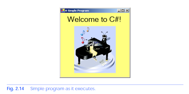
2.6 Simple Program: Displaying Text and an Image
In this section, we create a program that displays the text “Welcome to C#!” and an im-
age. The program consists of a single form that uses a label to display text and a picture box
to display an image. Figure 2.14 shows the program as it executes. The example here (as
well as the image file used in the example) is available on our Web Site (www.dei-
tel.com) under the Downloads/Resources link.
We do not write a single line of program code. Instead, we use the techniques of visual
programming. Various programmer gestures (such as using the mouse for pointing,
clicking, dragging and dropping) provide Visual Studio .NET with sufficient information
for it to generate all or a major portion of the program code. In the next chapter, we begin
our discussion of writing program code. Throughout the book, we produce increasingly
substantial and powerful programs. Visual C# programming usually involves a combina-
tion of writing a portion of the program code and having Visual Studio .NET generate the
remaining code.
To create, run and terminate this first program, perform the following steps:
1. Create the new project. If a project is already open, close it by selecting File >
Close Solution from the menu. A dialog asking whether to save the current so-
lution may appear in order to keep any unsaved changes, save the solution. Create a new Windows application for our program. Open Visual Studio .NET, and select
File > New > Project... > Visual C# Projects > Windows Application
(Fig. 2.15). Name the project ASimpleProgram, and select a directory in which
to save the project. To do this, click the Browse... button, which opens a Project
Location dialog (Fig. 2.16). Navigate through the directories, find one in which
to place the project and select OK. This selection returns us to the New Project
dialog; the selected folder appears in the Location text field. When you are sat-
isfied with the location of the project, click OK. Visual Studio .NET will load the
new solution, and a form labeled Form1 will appear.


2. Set the form’s title bar. First, set the text that appears in the title bar. This text is
determined by the form’s Text property (Fig. 2.17). If the form’s Properties
window is not open, click the Properties icon in the toolbar or select the View
menu’s Properties Window command. Use the mouse to select the form; the
Properties window shows information about the currently selected item. In the
window, click in the box to the right of the Text property’s box. To set a value
for the Text property, type the value in the box. In this case, type A Simple
Program, as in Fig.2.17. Press the Enter key (the Return key) when you have
finished to update the form’s title bar in the design area.

3. Resize the form. Click and drag one of the form’s enabled sizing handles (the small
squares around the form shown in Fig. 2.18) to change the size of the form. Enabled sizing handles are white. The mouse cursor changes appearance when it is
over an enabled sizing handle. Disabled sizing handles are gray. The grid on the
background of the form is used to align controls and does not appear when the pro-
gram executes.
4. Change the form’s background color. The BackColor property specifies a
form’s or control’s background color. Clicking BackColor in the Properties
window causes a down-arrow button to appear next to the property value
(Fig. 2.19). When clicked, the down arrow drops down to display other options.
(The options vary, depending on the property.) In this case, it displays the tabs
System (the default), Web and Custom. Click the Custom tab to display the
palette (a selection box of colors). Select the box that represents yellow. The pal-
ette will disappear, and the form’s background color will change to yellow.


5. Add a label control to the form. Double-click the label control in the Toolbox.
This action creates a label with sizing handles in the upper-left corner of the form
(Fig. 2.20). Double-clicking any Toolbox control places it on the form. Alterna-
tively, programmers can “drag” controls from the Toolbox to the form. Labels
display text; our label displays label1 by default. Notice that our label is the
same color as the form’s background color. The form’s background color is also
the default background color of controls added to the form.
6. Set the label’s text. Select the label so that its properties appear in the Properties
window. The label’s Text property determines the text (if any) that the label dis-
plays. The form and label each have their own Text property. Forms and controls
can have the same types of properties without conflict. We will see that many con-
trols have property names in common. Set the Text property of the label to Wel-
come toC#! (Fig.2.21). Resize the label (using the sizing handles) if the text
does not fit. Move the label to the top center of the form by dragging it or using
the arrow keys. Alternatively, you can move the label by selecting Format >
Center In Form > Horizontally from the menu bar.


7. Set the label’s font size, and align the label’s text. Clicking the Font property val-
ue causes an ellipsis button (…) to appear next to the value, as in Fig. 2.22. The
ellipsis button indicates that a dialog will appear when the programmer clicks the
button. When the button is clicked, the Font window shown in Fig. 2.23 is dis-
played. Users can select the font name (Microsoft Sans Serif, Arial, etc.), font
style (Regular, Bold, etc.) and font size (8, 10, etc.) in this window. The text in
the Sample area displays the selected font. Under the Size category, select 24
and click OK. If the text does not fit on a single line, it will wrap to the next line.
Resize the label if it is not large enough to hold the text. Next, select the label’s
TextAlign property, which determines how the text is aligned within the label.
A three-by-three grid of alignment choices is displayed, corresponding to where
the text appears in the label (Fig. 2.24). Select the top-center grid item, so that the
text will appear at the top center of the label.
8. Add a picture box to the form. The picture-box control displays images. This step is
similar to Step 5. Find the picture box in the toolbox, and add it to the form. Move
it underneath the label, by either dragging it or using the arrow keys (Fig. 2.25).


9. Insert an image. Click the picture box to load its properties in the Properties
window, and find the Image property. The Image property shows a preview of
the current picture. No picture has been assigned, so the Image property displays
(none) (Fig. 2.26). Click the ellipsis button to display an Open dialog
(Fig. 2.27). Browse for a picture to insert, and press Enter key. The proper formats
of an image include PNG (Portable Networks Graphic), GIF (Graphic Interchange
Format) and JPEG (Joint Photographics Experts Group). Each of these file for-
mats is widely supported on the Internet. To create a new picture, it is necessary
to use image-editing software, such as Jasc Paint Shop Pro, Adobe Photoshop El-
ements or Microsoft Paint. We use the picture ASimpleProgramImage.png,
which is located with this example on the CD that accompanies the book and on
our Web site (www.deitel.com). After the image has been inserted, the picture
box displays as much of the picture as it can (depending on size) and the Image
property shows a small preview. To display the entire image, resize the picture
box by dragging the picture box’s handles (Fig. 2.28).


10. Save the project. Select File > Save All to save the entire solution. To save an
individual file, select it in the Solution Explorer, and select File > Save. The
created program stores the source code in the C# file Form1.cs. The project file
contains the names and locations of all the files in the project. Choosing Save All
saves both the project and the C# file.
11. Run the project. Prior to this step, we have been working in the IDE design mode
(i.e., the program being created is not executing). This mode is indicated by the
text Microsoft Visual C# .NET [design] in the title bar. While in design mode,
programmers have access to all the environment windows (i.e., Toolbox and
Properties), menus, toolbars and so forth. While in run mode, however, the pro-
gram is executing, and users can interact with only a few IDE features. Features
that are not available are disabled or grayed out. The text Form1.cs [Design] in
the title bar means that we are designing the form visually, rather than program-
ming it using code. If we had been writing code, the title bar would have contained
only the text Form1.cs. To execute or run our program, we first need to compile
it, which is accomplished by clicking on the Build Solution option in the Build
menu (or type <Ctrl> + Shift + B). The program can then be executed by clicking
the Start button (the blue triangle), selecting the Debug menu’s Start command
or pressing the F5 key. Figure 2.29 shows the IDE in run mode. Note that the IDE
title bar displays [run] and that many toolbar icons are disabled.


0 comments:
Post a Comment